Sense Bike
Sense Bike
“Sense Bike” is a Brazilian manufacturer of high performance bicycles, willing to compete in quality and beauty with the big global brands. The company is part of a larger business group, and demanded its own headquarters closer to the growing Belo Horizonte market, including a showroom attached to its corporate office.
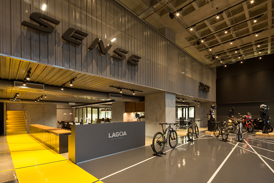
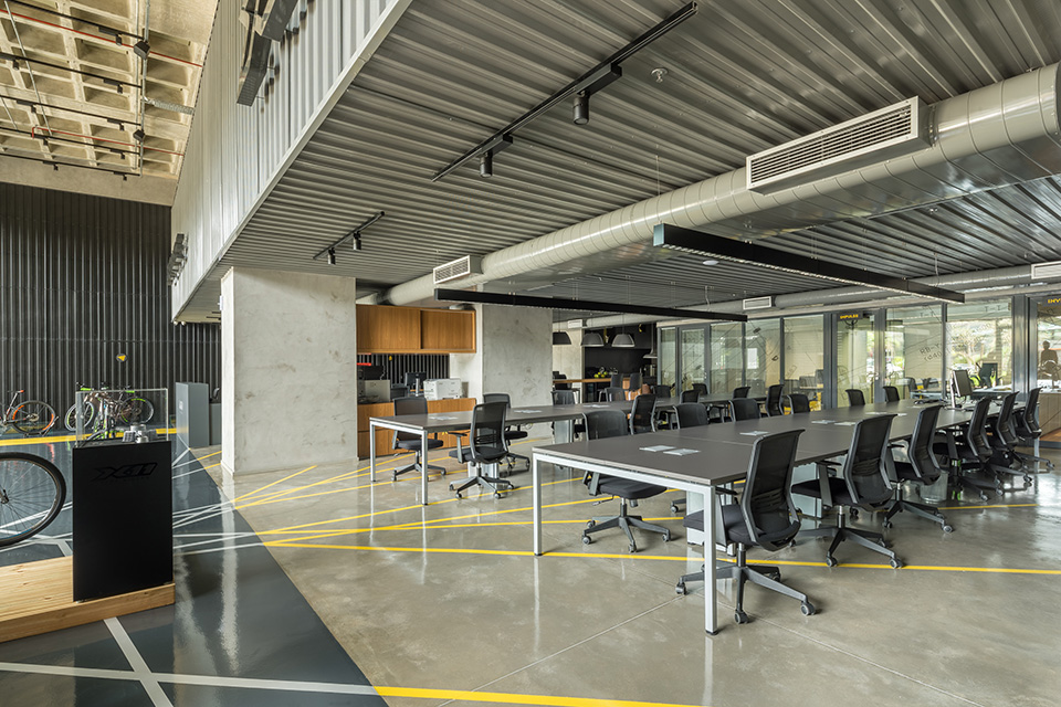
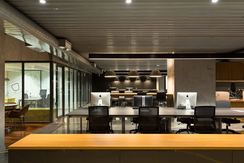
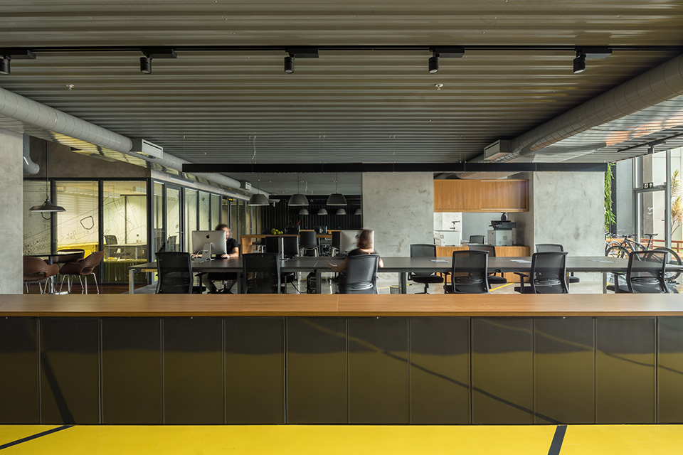
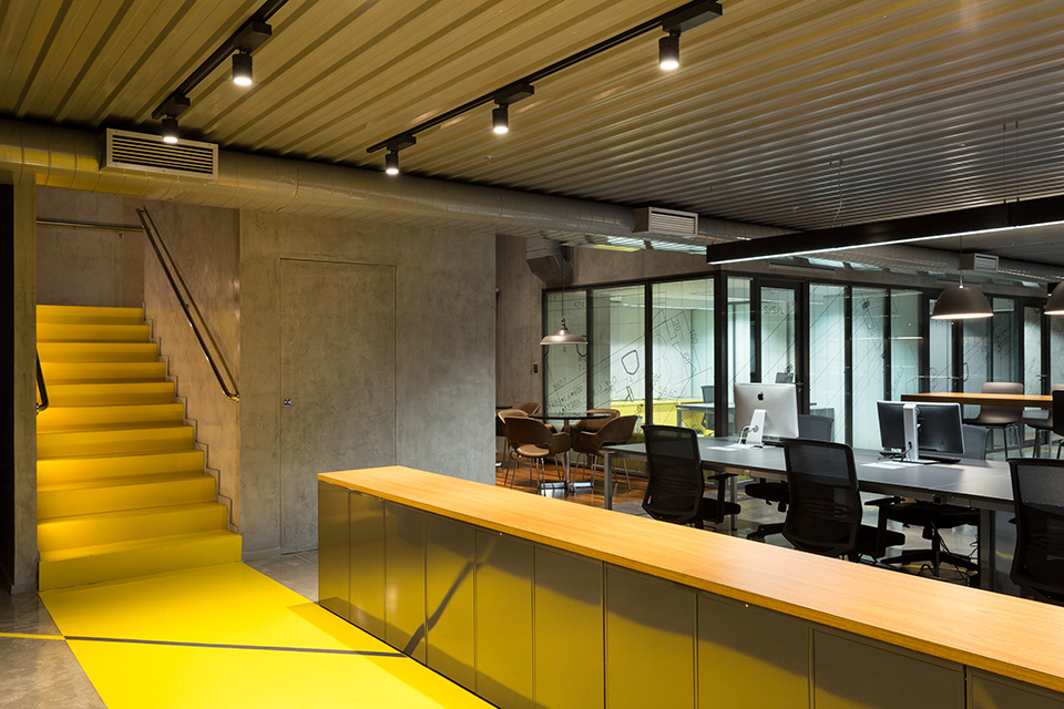
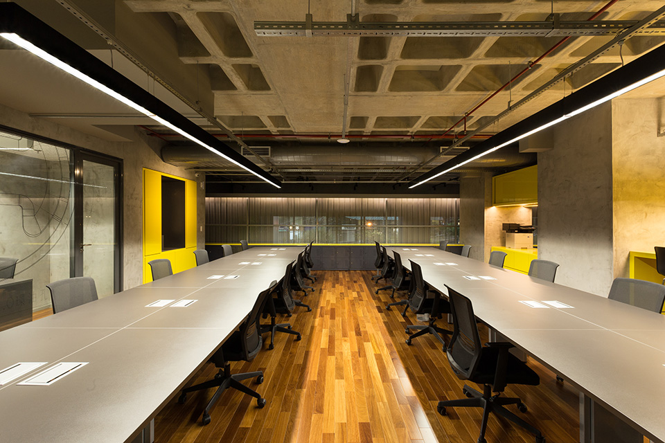
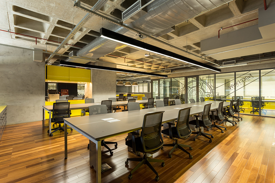
The program consists basically of office workspace, common areas and products test and display areas, with very little compartmentalization among the sectors. The open plan and layout requires various studies on the integration and privacy of spaces, hierarchy of flows, acoustic and thermal comfort, lighting and spatial distribution.
The design team (BCMF Architects, Hardy Design and Atiaia Lighting Design) worked in an integrated way, together with the client, since the very beginning. Architecture, Graphic Design and Lighting were conceived and designed in a multidisciplinary way, working out together all solutions with the other engineering disciplines throughout the process.
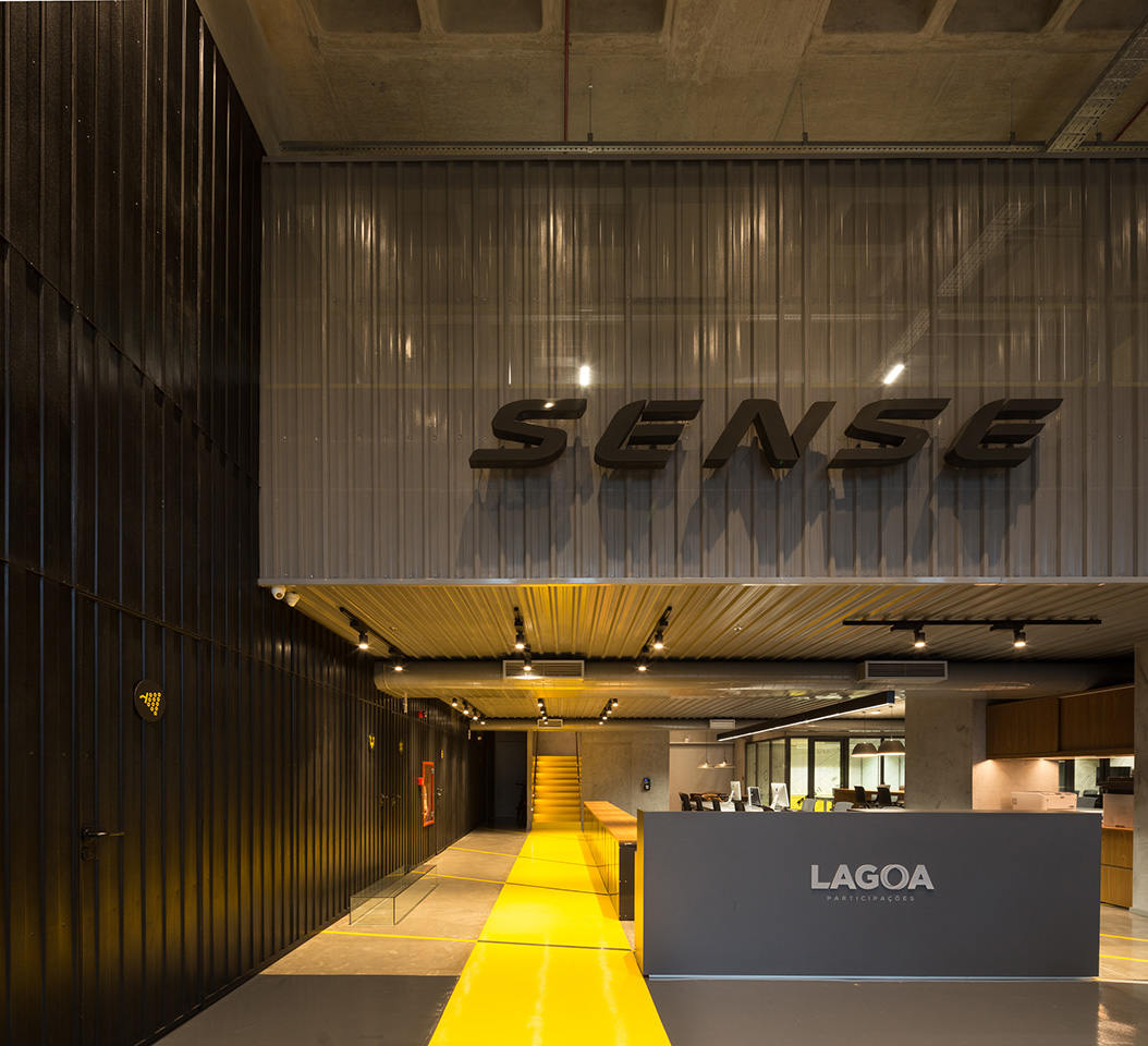
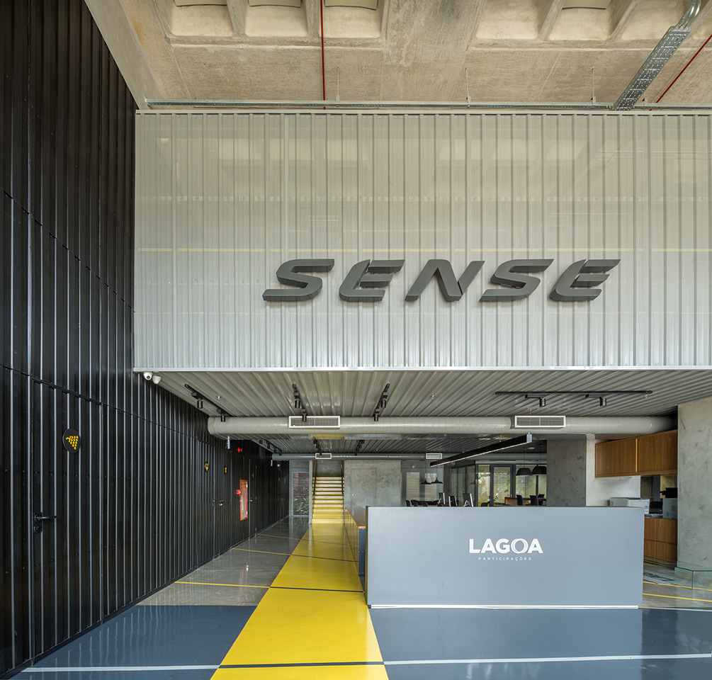
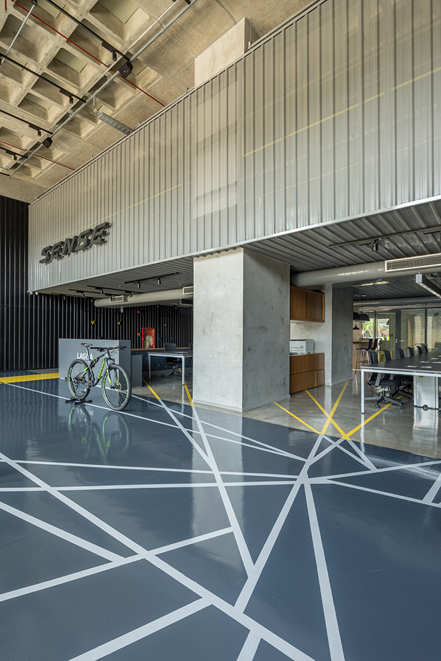
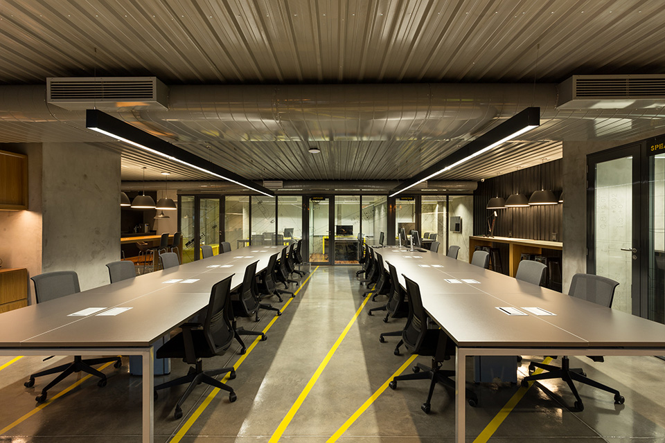
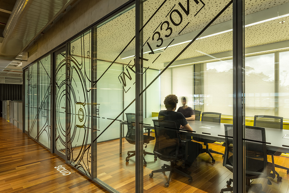
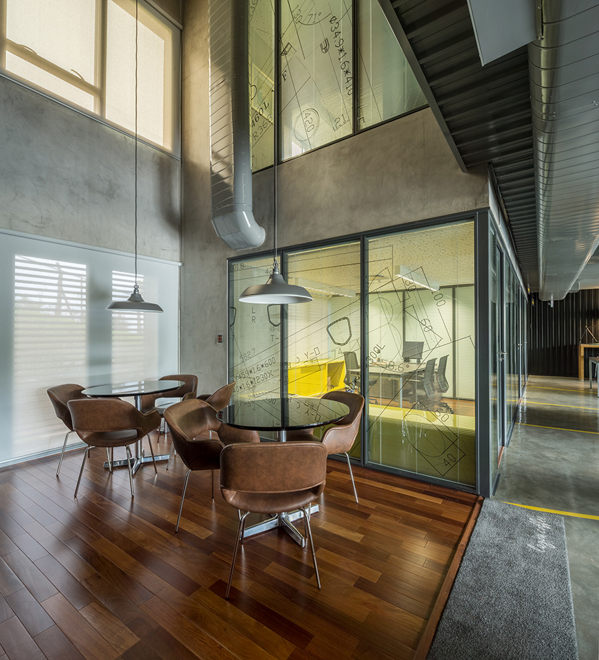
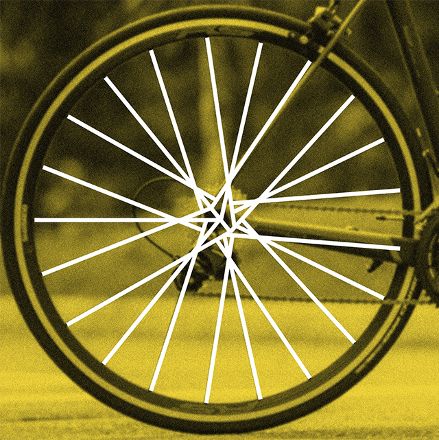
The idea of integration and movement was translated into the figure of striking rays, an interpretation of the light structural components of a bicycle wheel. Its axis radiates from the double-height space of the main showroom in which the bikes are displayed, and the lines cross over the space connecting the various sectors in an unusual way, spreading from the first floor to the new mezzanine level.
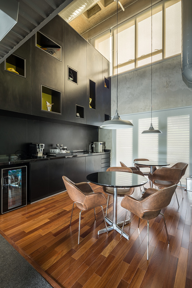
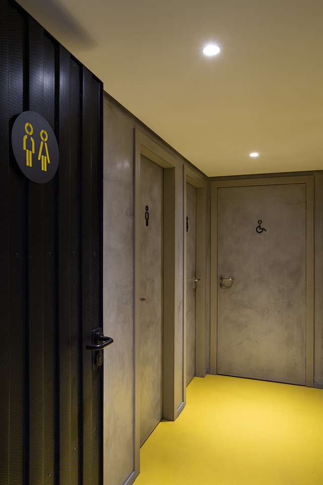
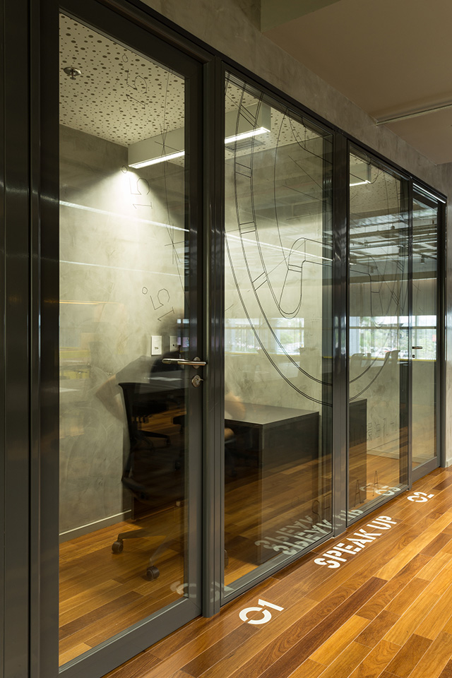
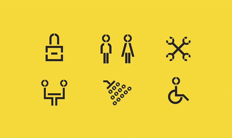
The materials are simple and industrial, and installations and structures are mostly apparent. The graphic design reinforces the industrial character of the company and explores the design of the object manufactured by the company, seeking to enhance the notions of lightness, freedom, adventure and fun that are part of riding on two wheels. Stencil painting on the floor complements the signage system, organizing the flows of the corporate space.
The lighting design highlights colors, materials, textures and graphics used, revealing transparencies, filling volumes, identifying working spaces and community areas. Due to the darker colors chosen by the design team, vertical surfaces were lit up in order to reduce the perception of contrasts and avoid the impression of a dark environment, as spatial surroundings are perceived through individual peripheral vision. Optical features of brightness and glare control as well as light distribution were used to ensure maximum visual comfort to the Sense Bike team.
